Browse Through Our Inventory
* Calculated price is based on the manufacturer's suggested retail price. Shipping and preparation included, taxes extra. The rebate and purchase price displayed may vary depending on whether the vehicle is leased, financed, or paid in cash. While every reasonable effort is made to ensure the accuracy of this information, we are not responsible for any errors or omissions contained on these pages. Prices, payments and rates are subject to change without notice, please verify all information and pricing with a sales representative or ask online.
The Best Range of Electric Models
Discover Our Trucks
Promotions and Special Offers
Quality Pre-owned Vehicles
Welcome to Le Relais ChevroletLe Relais Chevrolet
Welcome to Le Relais Chevrolet Buick GMC, your trusted dealer in the heart of Montreal. We have served new and pre-owned vehicle buyers and GM vehicle owners with passion and dedication for decades with the same enthusiasm. This is what has allowed us to turn our clients into loyal customers who come back to see us for all their needs in terms of new or pre-owned vehicles or for after-sales service.
The range of new Chevrolet, Buick and GMC vehicles offered at Le Relais Chevrolet Buick GMC gives you a large selection of models and vehicles of all types able to meet all your needs while respecting your budget. At Le Relais Chevrolet Buick GMC, we have a team of professional sales representatives who look forward to meeting you and who love their work. This is reflected in the quality of the customer service they provide, and you will feel their passion as soon as you walk through our doors.
A Large Selection of New Chevrolet, Buick and GMC Vehicles
Le Relais Chevrolet Buick GMC is one of the most reputable and largest dealerships on the Island of Montreal. We have an impressive selection of the latest new Chevrolet models including SUVs, trucks and electric cars. We also have all of the new Buick models and GMC trucks and sport utility vehicles as well.
New Chevrolet Vehicles
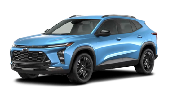
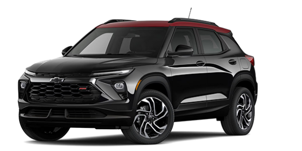
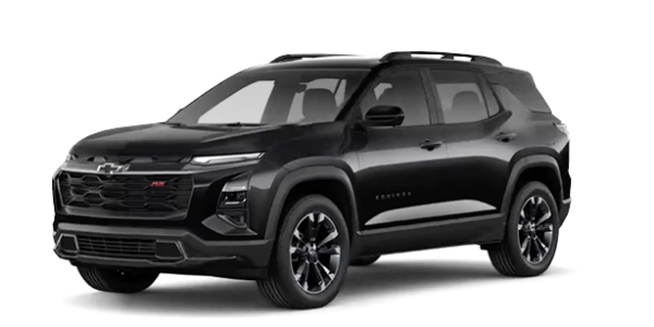
Chevrolet has one of the most comprehensive new vehicle lineups in the industry, and you're sure to find the perfect vehicle for you and your family within its vast family of available models. Chevrolet vehicles include spacious sport utility vehicles, rugged trucks and several fuel-efficient cars. Chevrolet also offers the new Chevrolet Bolt, a fully electric car that is revolutionizing the industry with its affordable starting price combined with its long range.
New Buick Vehicles
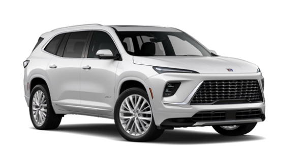
Buick offers a large selection of luxury vehicles to consumers, starting with the new Buick Envision and the completely redesigned Buick Enclave. We also have several Buick Encore utility vehicles to offer in addition to the Buick Regal luxury sedan.
New GMC Vehicles
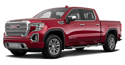
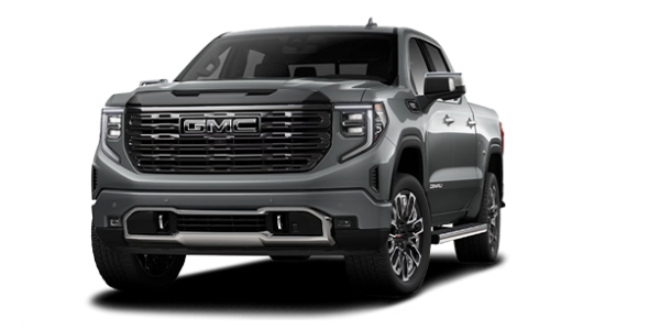
If you're looking for a tough truck, the new GMC Canyon and GMC Sierra will be able to meet your needs. We also have several new GMC Sierra HD's to offer at Le Relais Chevrolet Buick GMC. Our truck experts understand your needs and can help you configure the GMC truck that's right for you. If you need a sport utility vehicle instead, take a look at the GMC Terrain, GMC Acadia and GMC Yukon we have in stock.
Quality Pre-Owned Vehicles in Stock
In addition to our large selection of new vehicles, we also have several high-quality pre-owned vehicles to offer our clients in Montreal. We take the time to inspect all of our vehicles and make sure we only offer reliable and durable used cars, SUVs and trucks. Once you find your perfect pre-owned vehicle, you can take advantage of our competitive prices and advantageous financing plans offered with reduced interest rates.
Exceptional After-Sales Services
Once you own a new Chevrolet, Buick or GMC vehicle, you can take advantage of the best after-sales service on the island of Montreal thanks to our experienced experts and technicians. Le Relais Chevrolet Buick GMC prides itself on the quality of its maintenance services as well as all the other after-sales services we provide to our customers. We offer you detailing services, original GM parts and accessories and a host of other services that keep your car in perfect condition.
Come learn more about all of our services today at Le Relais Chevrolet Buick GMC.
Two Dealerships Under the Same Roof
In need of more options? At our partner, Relais Cadillac, you will find a large collection of new and used Cadillac vehicle. You will also find the same impeccable service and devotion that makes us an undeniable destination for the purchase of your next vehicle. Visit their website today!
